Making of Teri Meri Kahaani
Well, you see the film involves stories from different time periods. There is 1910, 1960 and 2012 all looking at three love stories. It’s a nice experimentation in form and content. Like Kunal’s earlier work Hum Tum was experimentation in form. So when Kunal and I discussed, we knew that we have to shoot three different time periods. 1960’s being very Bollywood, 2012 has a very modern look and 1910 is very rustic. But again we have refrained from using sepia tone. Because Kunal’s argument was that in 1910, there was less pollution so the colors were more saturated so 1910 is very colorful. As opposed to nostalgic period where they tend to make it sepia toned. In the 1960’s where Priyanka plays a film actor she is a woman of many looks. In some shots she is pink, in some she is peach and sometimes a bit cold. We have consciously kept that for her.
When you talk about the look and the feel of the 1960’s, what was your lighting design?
Kunal and I sat and watched a number of films together from the 1950’s. As a cinematographer, I never want to copy what other people have done. Having said that, whatever I do will have been done by somebody else. It was a conflict between being original and yet taking estimations from other things. My ideas during the shoot kept changing because we could not quite decide until we started shooting. Even though we had so much time to prepare, we couldn’t possibly do it. Not because we didn’t have the time, but because we had so many choices. At some point, Kunal decided to make the final decision when the actors had come on to the sets. I think it worked quite well for us. Because we didn’t have a plan, so we never went with predetermined ideas. And I think that’s why giving Priyanka different looks in the film works as an identity. In one scene I would like to light her in a particular way and then in the next one I would change it because I am not happy. So I think giving her different looks in the 1960’s worked quite well for her.
Could you share some instances from the film?
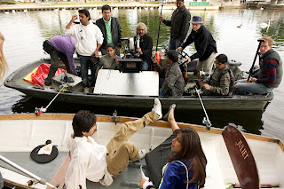
In one song, which is supposed to be a premiere night – a party where Priyanka arrives with the producer and the lead actor. And somehow Shahid is there, a struggling musician and who is having an affair with her. For that song I played around with the lights but other than that, unlike the movies of the 60’s and the 70’s, I didn’t use colored lights on my actors. We wanted to pay more attention to the art direction to get the right kind of look. For example, the film begins from the 1960 on a train, and we couldn’t find a locomotive like the Steam Engine in India. So some parts of the scenes were shot in England where they maintain the trains so well. In Yorkshire, there is a steam engine ride that you can take. And when we saw that, we realized we needed to shoot the 1960’s portion there even though the film is situated in Mumbai. In fact, Kunal wanted to even shoot the interior train shots, but we had a lot of issues in terms of placement of cameras. The interiors were shot in a studio in Mumbai. Also in England we were able to experiment with the very format of the film. The entire 1960’s portion has been shot in Anamorphic. Whereas the 1910 bits I wanted to shoot on Alexa. But unfortunately due to technical and other reasons we could not do that. So we ended up shooting on super 35 Panavision instead. The 2012 bits were also shot on Panavision.
What were the sets like and what kind of lighting package did you use for the film?
We had huge sets, huge antique pieces and wherever we could we made the flooring to the right perspective as we would normally want to have it. We majorly shot in Filmistan, which was huge green screen setup. I used 370 Multis (2K lights) just to light the green screen alone.
We used AutoCAD, the architectural designer’s program, to fix our lights and to plan. My assistants and I worked out the whole lighting choreography. It worked quite well and was an enjoyable process.
How would you describe Mr Kunal as a Director when it comes to camera movements?
Kunal is a very spontaneous director and open to various ideas all the time. Sometimes I do have a different perspective about a certain scene in that case most of the time we come to an amicable solution and everything works out. In the end the director is the Captain of the ship and if he has something very specific then it has to be done his way. Simply because I believe that there are times when certain nuances of the screenplay I may not even understand or that he may not have told me. I have worked with Kunal before on his film Hum Tum, so I sort of understand him.
In terms of coverage of lens – he preferred wide-angle lens. Again it’s his commercial background: ‘As we were shooting in England and because of the beautiful landscape he wanted to shoot wide frames for e.g. If I am using a 50mm lens, he would prefer 10mm.
He also likes to use Steadicam and all sorts of equipment. But that comes from his hard-core commercial background that he wants to use jibs and dollies. We carried the dolly all the way from India to England.
Why would that be?
Logistics. Cost of dolly there is very expensive. And in India because we make so many films, it’s easy for Kunal Kohli production to strike a deal here. In India, it is a nice system where you strike a deal with the suppliers and the dolly is yours for a fixed price throughout the shoot. It makes more economic sense to get our own equipment. In fact, we carried all our lights from Mumbai because it still worked out cheaper.
What was your lighting ratio in the film?
Very honestly with the DI process coming in, I tend not to shoot with high lighting contrast ratios. Because on black and white films, it tends to work better, but on color in the shadow areas with the Digital Intermediate, I have reservations on what color tones does to darker areas, so I tend to avoid shooting with high contrast ratios. I have gone 1:2 at times, but even that is a big ratio for me. I tend to keep my light flat but I do appreciate the highlights being there as opposed to making the shot high contrast. These are all actors. They like to see themselves in nice glossy light. So you have to make sure that you make them look nice, but at the same time keeping in mind certain sense of time and direction for the light. So obviously, one can’t keep shooting flat all the time. Having said that you have to shoot in flattering light, at least the one that illuminates the actors. That little gloss, that quality where your actors look a million dollars. Alongside, you have to maintain a certain direction. It’s slightly tricky. I tend to do my general light and then depending on situations I use my 18 Kilowatt or two 6 K’s or two 12 K’s which I carry with me and which is always handy and moving around. That’s how I work. I come from a long advertising background.
Any creative shot or element in the movie that you are quite thrilled about.
I think I am thrilled about the 1960’s and 1910 portion, because a lot of stuff went into it. Don’t know where to start or single out as the most creative. I have used a lot of green and blue screens and in India we haven’t had that many great green screens. But this is the part of the film in which I take great pride.
Lenses
1960’s portion I shot Hawk Anamorphic. They are basically the so-called neo-generation of Anamorphic lenses. Hawks has 35, 50, 75, 100, 125 and I had the HR zoom with a rear Anamorphic attachment. On Arri 435 I used Master Primes.
Film stock
Mostly Kodak 5247 that was 200T. I did not use 500 film stock because of a lot of green screen was involved, I had pretty good lenses, so I mostly used 200T right through the film. The 2012 portion I shot on Fuji stock. I actually wanted to experiment a lot with the stock because there are three different periods. As I told you before I wanted to shoot the 1910 portion on Alexa, but Kunal had very little faith in the digital format at that point in time, so we shot on film.
DI – Prime Focus by Ashirwadh
VFX – ICUBE by Sachin Dhole
As told to Adhiraj Singh


